tsa brand evolution
Client | TSA Management (now TSA Riley)
Role | Brand Identity Development, Logo Design, Brand Guidelines, Brand Collateral and Digital Campaign Material
The brief
While at TSA Management, a global project consulting and infrastructure advisory firm, this project involved developing a new sub-brand identity for TSA Advisory to clearly differentiate advisory services from the core project brand, alongside a refresh of the corporate identity for consistency.
The Solution
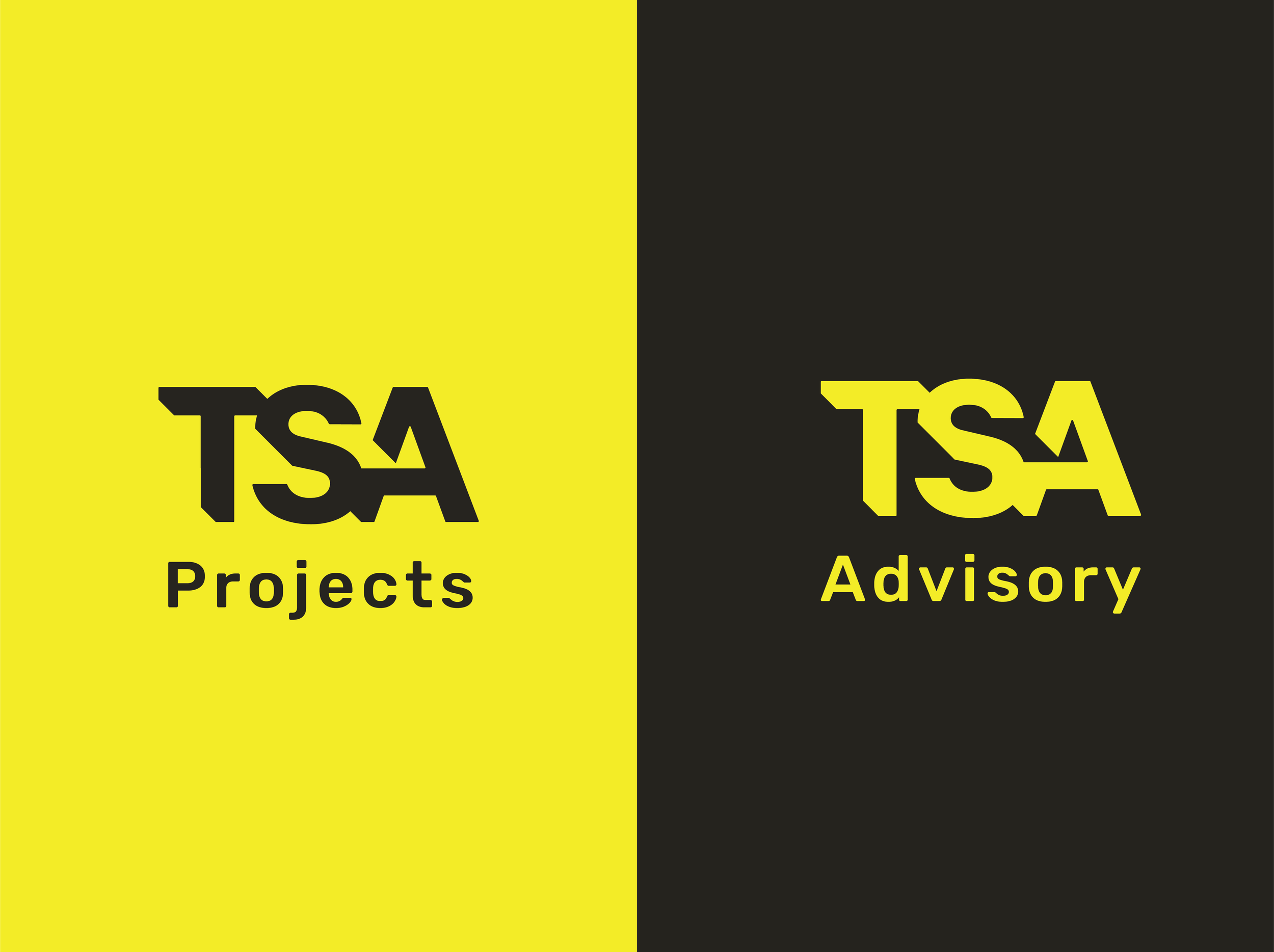
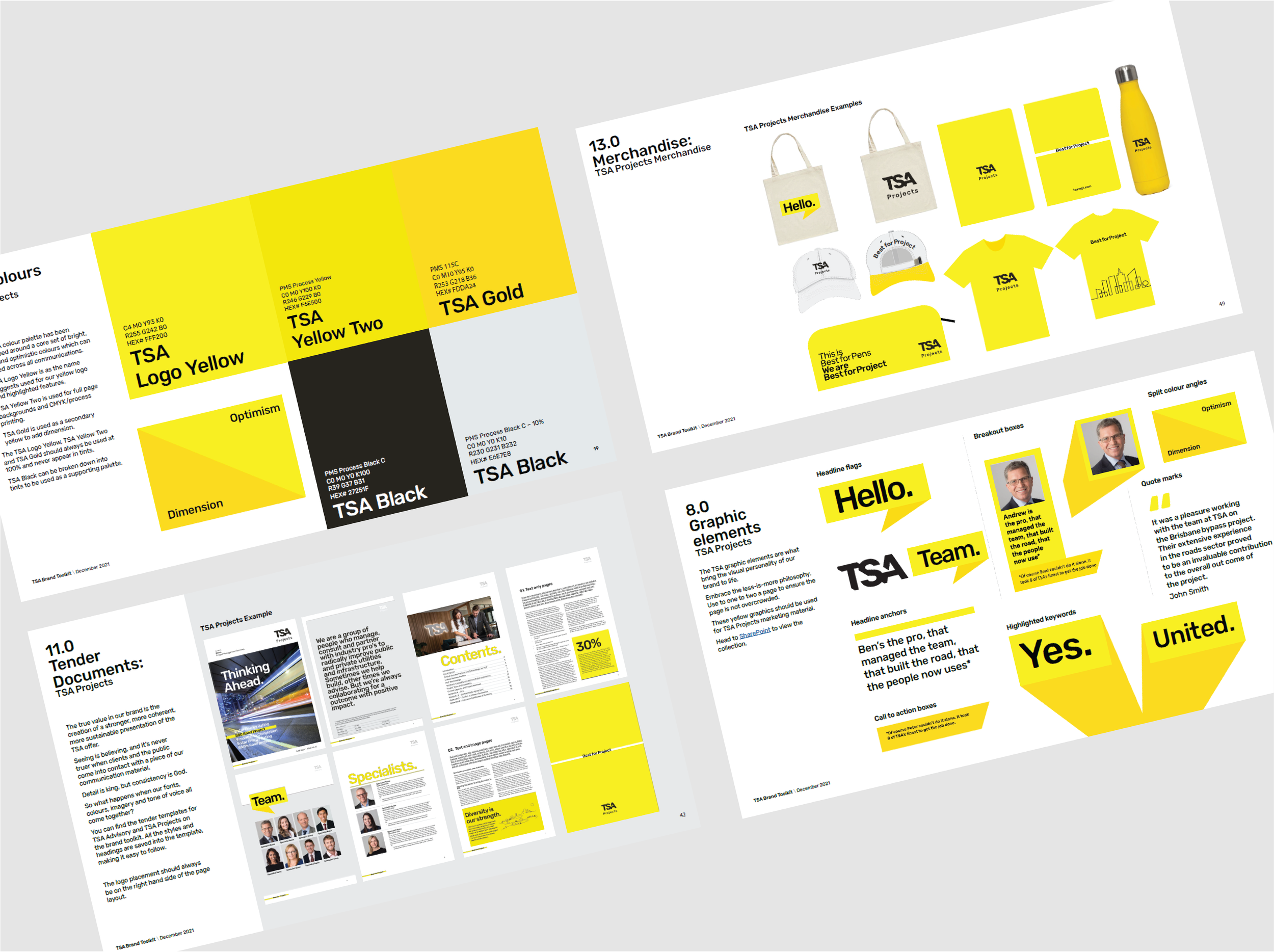
TSA expanded their advisory services and created two sub-brands, TSA Projects and TSA Advisory, to make the distinction between project delivery and advisory lines more established.
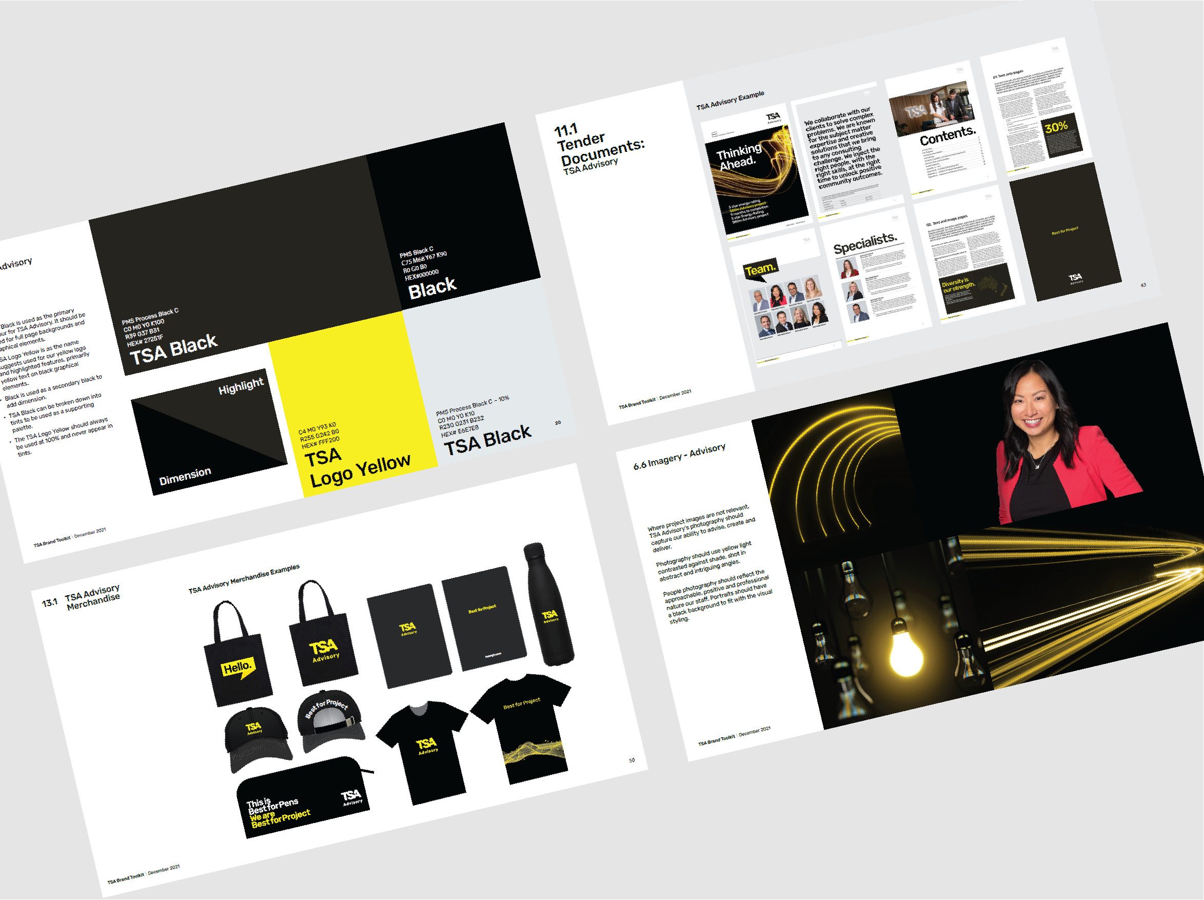
This solution involved developing a new brand identity for TSA Advisory, while TSA Projects kept the existing TSA branding. This included designing new logos for both sub-brands, a distinct colour palette, marketing materials, a photographic and illustration style, and evolving the brand guidelines.
The TSA Advisory identity uses black as the main colour with yellow highlights, reflecting confidence, expertise and creativity. Photography and visuals were designed to show TSA Advisory’s values of creating, partnering and advising, using yellow and black light imagery to bring creative solutions to life. The rollout included a full set of collateral, such as templates, event banners, apparel, stationery and digital campaign assets.